Monday, June 24, 2013

Bathroom Update

You'd think by how long it's been between posts that the bathroom would be done. Nope. But, having said that, it looks a little more like a bathroom now.

Here's what it looked like after they put the walls up. Oh, the original plan was to leave the walls alone since they were in good shape. But, that changed when the plumber came. I got that, "I have to show you something," statement that always makes your stomach hurt. Turns out the plumbing that ran to the two showers was not right. The pipes were too small (1/2 inch) and they needed to find out where the 3/4 inch pipes stopped and tap into those and run the same size all the way up to the bathroom. The image that popped into my head was like something out of "The Money Pit" with holes the the walls up from the lower level.


Luckily, the pipes that they needed to tap into were only just behind where the toilet was on the other wall. So, after the plumber spent the whole day running new pipe we were missing half of a wall. The guys doing most of the work just decided it would be easier to tear them all out. So, while it costs more, at least we have new walls. That's good, right? I said RIGHT?


Anyway, they now have all the tile installed in the shower and on the floor, as well as new paint on the walls.


The tile isn't as brownish as this shows. Blame it on poor white balance. Of course, do you really care about the color of the tile in my bathroom? Weirdo. 


Tomorrow they come to measure for the vanity top and for the shower door. Soon, maybe I can stop having to walk downstairs to go to the bathroom in the middle of the night.


Tuesday, June 11, 2013

The start of the new bathroom

So, finally, we are having our master bathroom remodeled. It's not like we were planning on doing it the year after we moved in 10 years ago or anything. (Hint: we were.)

I never really thought we'd ever get around to it, but we couldn't take it anymore. You know things are bad when you area happy to stay in a hotel because the bathroom is so much nicer than yours. Like the vanity isn't from the late 60s. And not the cool part of the 60s either, but the drab, dreary part.

So here area couple of before shots.

Here we have the beautiful vanity. I'm not entirely sure what the material is on top, but I'm sure it looked cool under a black light or while on LSD. Now it's just fugly. Oh, you can kind of see the shower in the mirror. It didn't take a photo of the inside of the shower because I didn't want to gross anybody out. It was bad. No amount of cleaner could help it anymore.


Here you can see the shower off to the right and the toilet. Nothing terrible here as the floor is relatively recent, not from us though, as is the toilet. The door with the mirror on it is another lovely relic from the late 60s. It reminds me of the ugly brown paneling that everyone had back then. Why was that considered nice looking? Seriously, it's like every designer from that time had some sort of color deficiency with their eyeballs.


Today they came in and tore everything out. The walls are still up. But the ceiling, shower and fixtures are all gone. See, you can see the inside of the roof and everything.


Now the wall where the vanity was is just mostly white with some black globs of some sort of glue that held the mirror on the wall. Surprisingly, they got the mirror off without breaking it. No seven years of bad luck for this house.


The funny thing here, which nobody else will notice, is how high the ceiling went. Inside the shower it was only about six-and-a-half feet tall. It looked like some duct work was in there, but nope, just for "looks" I guess. This shower is going to seem so much bigger now.


I'll try to update as we go along. I know this is the highlight of everyone's life right now.


Monday, March 25, 2013

Before and After with The Nik Collection

As we all know Google is pulling the plug on Google Reader. Nobody was particularly happy with that, nor was I. But thanks to Florinda and others I am now happily using Feedly and working on getting used to it.

When Google announced shutting down Reader I was nervous about their recent acquisition of Nik software. I only use one of their plug-ins for photography right now, but I planned on buying others. Or, all of them really at some point. The same day Google announced the Reader shutdown they also stated they are not going to update Snapseed for PC or Mac. I became doubly nervous then. I figured they were going to shutter all the Nik software stuff and replace it with something worse.

Well, today Google announced they are reducing the price for the entire bundle to $149, which is a great deal. They also said that if you had purchased any of the other plug-ins already you would receive an email telling you how to get the whole collection for free. That pretty much made my day. Now, I want to say this is not any sort of sponsored post. I was just really excited about this. Do I think Google will still keep this alive? I hope, butI don't know. I'm not sure how Topaz or onOne is going to respond to this. It's not too cool for them, that's for sure.

Anyway, since I downloaded it I thought I'd try them all out with a before and after photo. This was just a test and not a great photo, but it shows what the software can do. I really do recommend the new Nik Collection. Though I'm not a fan of the icons they use, but what can you do about that.


Before
After

Now, again, this isn't perfect, but just a quick tweaking I did with Viveza 2, Color Efex Pro 4 and Dfine 2. Although, the second photo is much closer to what Akaka Falls looked like in real life. So, go, buy, if you are into photography that is. If not, it's cheap enough to buy for a gift for someone you love, or just kind of tolerate.


Tuesday, March 19, 2013

This is how you make cooking eggs seem creepy

Okay, maybe that is an exaggeration. But, watch the video first. Watch how the eggs slowly slip out of the top of the machine. Then we'll talk.


Okay, does it not remind you of some creepy X-Files episode where the stuff slowly comes to life and take over your brain or something?

Beyond that, this is one of those classic making-whatever-is-too-hard-so-use-this-dumb-gadget commercial. Yes, if you flip your eggs over from about two feet off the pan the yolks will break. But, if you are not a complete moron, you won't do that. Also, that pan is obviously a non-stick pan, why are the eggs sticking? Are they even trying? I don't think so.

With the way this cooks the only kind of eggs you can make are essentially hard-boiled or omelets, so I don't know why they compare it to an over-easy egg. Besides that, I imagine the outside of this thing will get pretty messy, right? Does the outside clean well?

I'm sure you can make some tasty omelet like things in here, just add some cheese and bacon, (pre-cooked I assume since I don't this will fully cook the bacon) and you get a tiny omelet. It looks like two eggs is about the max this thing will hold, so I hope that is all you make in your omelet.

I think the basic idea isn't really bad here. I think I'm just getting tired of the commercials that make everybody look like complete idiots. You have an idea on how to make eggs easier? That's great. Show me what it does and why it's a good idea. Maybe then people will not assume your product is some crappy gimmick.

I think I've been watching too much Shark Tank.


Sunday, January 27, 2013

Playing around with some new software

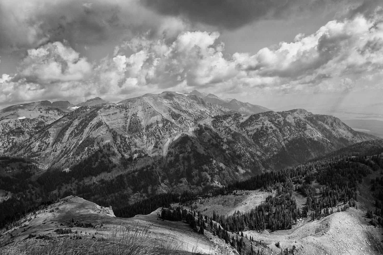
I'm trying out Nik Silver Efex Pro 2 software for black and white photo conversion. Why? I don't know. I was reading about it, I use their HDR Efex  Pro 2 software, it's Sunday, there is freezing rain outside...and just because. Anyway, I converted one photo from our trip to Wyoming last summer. It's kind of a boring shot in color so I thought I'd try converting it. I think it turned out okay for a first try.


There were some dark shadows on the range that may be a bit too dark here but, hey, I'm not a professional here.

Okay, time to go see if I need to chisel the car out of a block of ice.